Smart Color Selection: How to Choose the Perfect Paint Palette for Your Home
Paint color selection represents one of the most impactful yet challenging decisions in home remodeling. The colors you choose will influence your mood, affect your home’s resale value, and determine whether your space feels cohesive or chaotic. Whether you’re tackling a single room refresh or planning a whole-home makeover, understanding the principles of effective paint color selection can save you thousands in costly mistakes and create a space you’ll love for years to come.
This comprehensive guide is essential for homeowners embarking on renovation projects, real estate investors looking to maximize property appeal, and anyone who wants to make informed decisions about their living space. You’ll discover the science behind color psychology, learn professional techniques for creating harmonious palettes, and gain practical strategies for testing and implementing your chosen colors with confidence.
Understanding Color Theory Fundamentals for Paint Color Selection
Successful paint color selection begins with grasping basic color theory principles that professional designers rely on daily. The color wheel serves as your roadmap, organizing hues into primary colors (red, blue, yellow), secondary colors (green, orange, purple), and tertiary colors that bridge the gaps between them.
Color temperature plays a crucial role in how paint appears in your space. Warm colors—reds, oranges, and yellows—advance visually, making rooms feel cozier but smaller. Cool colors—blues, greens, and purples—recede, creating an illusion of expanded space and promoting calm. Neutral colors serve as the foundation, providing balance and allowing accent colors to shine without overwhelming the senses.
The Psychology Behind Color Choices
Colors trigger emotional responses that directly impact how you experience your home. Red stimulates energy and appetite, making it excellent for dining rooms but potentially overwhelming in bedrooms. Blue promotes tranquility and focus, ideal for home offices and bedrooms. Green creates balance and reduces eye strain, perfect for living spaces where you spend significant time. Yellow energizes and uplifts mood but can cause anxiety in large doses.
Understanding these psychological effects helps you align your paint color selection with each room’s intended function. A home office benefits from concentration-enhancing blues or greens, while social spaces like living rooms thrive with warm, welcoming earth tones or balanced neutrals that encourage conversation.
Analyzing Your Space: Light, Architecture, and Existing Elements
Before selecting any paint colors, conduct a thorough analysis of your space’s unique characteristics. Natural light significantly affects how colors appear throughout the day. North-facing rooms receive cool, consistent light that can make colors appear darker and more muted. South-facing rooms enjoy warm, bright light that intensifies colors. East-facing rooms get morning warmth followed by cooler afternoon light, while west-facing spaces experience the opposite pattern.
Artificial lighting adds another layer of complexity to paint color selection. LED bulbs with different color temperatures (measured in Kelvin) can dramatically alter paint appearance. Warm LEDs (2700K-3000K) enhance warm paint colors but can muddy cool tones. Cool LEDs (4000K-5000K) make cool colors pop but can make warm colors appear flat.
Working with Architectural Features
Your home’s architectural elements should guide your color choices rather than fight against them. High ceilings can handle bold, dark colors that would overwhelm smaller spaces. Crown molding and trim provide natural boundaries for color transitions. Built-in features like fireplaces or exposed beams can serve as focal points that inform your entire color scheme.
Consider your home’s exterior and surrounding landscape when making interior paint color selections. Colors that complement your home’s brick, stone, or siding create visual flow from outside to inside. Similarly, views of gardens, water, or natural landscapes can inspire and validate your interior color choices.
Creating Cohesive Paint Color Palettes
Professional designers use proven formulas for paint color selection that ensure rooms flow seamlessly together. The 60-30-10 rule provides an excellent starting point: use your dominant neutral color for 60% of the space (walls, large furniture), a secondary color for 30% (upholstery, window treatments), and a bold accent color for 10% (accessories, artwork).
Monochromatic schemes use varying shades and tints of a single color, creating sophisticated, calming environments. These palettes work exceptionally well in bedrooms and bathrooms where serenity is paramount. Analogous color schemes combine adjacent colors on the color wheel, such as blue-green-purple or yellow-orange-red, offering more variety while maintaining harmony.
The Power of Neutral Foundations
Modern paint color selection often begins with sophisticated neutrals that provide flexibility and longevity. Today’s neutrals extend far beyond beige and white to include complex greiges (gray-beiges), warm whites with subtle undertones, and soft, muted versions of traditional colors.
Greige has become particularly popular because it combines gray’s contemporary appeal with beige’s warmth. These colors work beautifully with both warm and cool accent colors, making them ideal for open-concept homes where spaces flow together. When selecting neutrals, always test them in your specific lighting conditions, as undertones can shift dramatically between paint swatches and full wall applications.
Professional Testing Techniques for Paint Color Selection
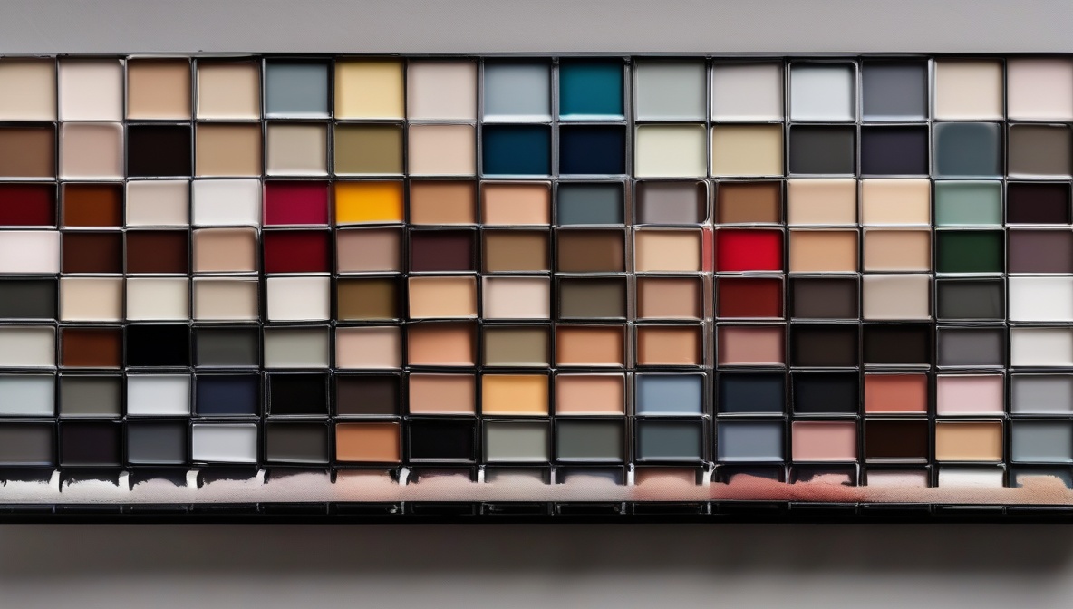
Never rely solely on small paint swatches for final color decisions. Paint manufacturers design these samples to look appealing under store lighting, which rarely matches your home’s conditions. Instead, purchase sample sizes and paint large sections—at least 2×2 feet—on different walls within the same room.
Observe your test patches at various times of day and under different lighting conditions. Morning light reveals different aspects of color than evening artificial light. Live with your samples for at least a week, noting how the colors make you feel during different activities and moods.
Using Digital Tools and Technology
Modern technology offers valuable support for paint color selection, though it shouldn’t replace physical testing. Many paint manufacturers provide apps that let you visualize colors in your space using your smartphone camera. While these tools provide helpful starting points, remember that screen colors never perfectly match real paint due to variations in display technology and lighting.
Professional color matching services can extract color palettes from inspiration photos, fabric samples, or existing elements you love. This technology proves particularly useful when trying to coordinate with fixed elements like countertops, flooring, or artwork that must remain in the space.
Room-by-Room Paint Color Selection Strategies
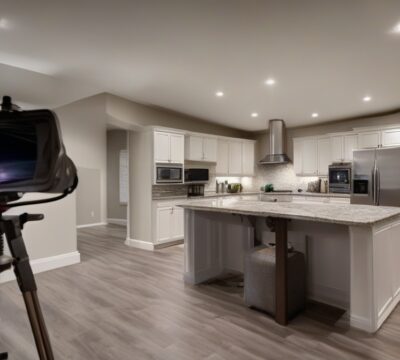
Each room in your home serves different purposes and should inform your paint color selection accordingly. Kitchens benefit from colors that enhance appetite and promote social interaction. Warm whites, soft yellows, and muted earth tones create inviting environments while showing off food beautifully. Avoid stark whites that can feel clinical or bold colors that might clash with food presentation.
Bedrooms call for colors that promote rest and relaxation. Soft blues, gentle greens, and warm neutrals create serene environments conducive to sleep. Avoid bright reds or energizing oranges that might interfere with your natural sleep cycle. Master bedrooms can handle slightly more sophisticated color schemes than children’s rooms, which benefit from cheerful but not overstimulating colors.
Living Spaces and Flow
Open-concept homes require careful paint color selection to create distinct zones while maintaining visual flow. Use varying intensities of related colors rather than completely different hues. For example, use a lighter version of your main color in the kitchen and a deeper version in the adjacent dining area.
Bathrooms present unique challenges due to moisture and typically limited natural light. Choose paint specifically formulated for high-humidity environments, and consider how colors will appear under vanity lighting. Lighter colors help small bathrooms feel larger, while spa-inspired blues and greens create relaxing retreats in master bathrooms.
References
- Color Association of the United States – Professional color psychology research and trends
- Pantone Color Institute – Color theory and application guidelines
- American Society of Interior Designers – Professional design standards and practices
Practical Implementation and Professional Tips
When implementing your paint color selection, proper preparation ensures professional results. Clean walls thoroughly and prime appropriately—this step is especially crucial when making dramatic color changes or covering existing bold colors. Use high-quality brushes and rollers designed for your specific paint type, as cheap tools can create streaky, uneven finishes that diminish even the most carefully chosen colors.
Consider the paint finish as part of your color selection process. Flat finishes hide imperfections but can be difficult to clean. Eggshell and satin finishes offer good durability while maintaining subtle elegance. Semi-gloss works well for trim and high-traffic areas but can highlight wall imperfections. The finish you choose affects how the color appears and performs in your space.
Timing Your Paint Projects
Plan your paint color selection and application timing strategically. Avoid painting during extremely humid or dry conditions, which can affect paint application and drying. Spring and fall typically offer ideal conditions for interior painting projects. If you’re painting multiple rooms, start with areas that receive the most natural light, as these spaces help you evaluate your color choices most accurately.
When painting open-concept spaces, maintain wet edges between sections to avoid visible lap marks. Work systematically from room to room, completing entire walls before moving to adjacent areas. This approach prevents color variations that can occur when paint batches aren’t perfectly matched.
Budget-Conscious Paint Color Selection
Smart paint color selection doesn’t require premium paint prices for every surface. Invest in high-quality paint for high-visibility areas like main living spaces and entryways, where color accuracy and durability matter most. Consider using more affordable options for closets, storage areas, and rooms with low traffic.
Many paint retailers offer color-matching services that can recreate expensive designer colors in their house brand formulations. This strategy allows you to achieve the exact paint color selection you desire while staying within budget constraints. Always request color verification before purchasing large quantities, as slight variations can occur during the matching process.
Maximizing Color Impact
Strategic paint color selection can create dramatic transformations without expensive renovations. Accent walls draw attention to architectural features and create focal points in otherwise neutral spaces. Choose accent colors that complement your main palette while adding visual interest—typically, a color that’s 2-3 shades deeper or a complementary color from across the color wheel works well.
Consider painting ceilings in colors other than standard white to add sophistication and visual height. Soft, warm whites or very pale versions of your wall colors can make ceilings feel higher while maintaining brightness. Darker ceiling colors work well in rooms with very high ceilings where you want to create a more intimate feeling.
Frequently Asked Questions
How many paint colors should I use throughout my home?
Most design professionals recommend limiting your main color palette to 3-5 colors throughout your entire home to maintain cohesion. This includes one or two neutrals as your foundation, 1-2 main colors for variety, and 1-2 accent colors for interest. You can use different intensities and shades of these base colors to create variation while maintaining harmony.
Should I choose paint colors before or after selecting furniture and décor?
Ideally, paint color selection should happen after you’ve chosen major furniture pieces and permanent fixtures like countertops and flooring. These elements are typically more expensive to change than paint, so it’s more cost-effective to coordinate paint colors with existing pieces. However, if you’re starting with a blank slate, you can choose paint first and select coordinating furnishings.
How do I make a small room look larger with paint color selection?
Light, cool colors reflect more light and create an illusion of expanded space. Soft whites, pale blues, light grays, and gentle greens work well for small rooms. Paint the ceiling the same light color as the walls to eliminate visual boundaries. Use semi-gloss or satin finishes rather than flat paint to reflect more light around the room.
What’s the biggest mistake people make when choosing paint colors?
The most common paint color selection mistake is choosing colors based on tiny swatches under store lighting without testing them in the actual space. Colors change dramatically based on lighting conditions, room size, and surrounding elements. Always test large samples in your specific room for at least a week before making final decisions.
How do I coordinate paint colors in an open floor plan?
In open-concept spaces, use varying intensities of the same color family or choose colors that are adjacent on the color wheel. For example, use a light gray in the kitchen, medium gray in the living area, and deeper gray for an accent wall. Alternatively, use warm whites throughout with different accent colors in each zone to define spaces while maintaining flow.
Can I use bold colors without overwhelming my space?
Yes, but use the 60-30-10 rule as your guide. Reserve bold colors for accent walls, not entire rooms, or use them in smaller doses through accessories and décor. If you love a bold color, consider using a much lighter tint of that color on your walls and incorporating the full-strength version through artwork, pillows, or other changeable elements.
How often should I update my paint colors?
Quality paint in well-chosen colors should last 7-10 years before requiring updates. However, you might want to refresh colors sooner in high-traffic areas or if your lifestyle changes significantly. Neutral base colors tend to have longer staying power than trendy colors. Focus on updating accent colors through accessories rather than repainting entire rooms if you want more frequent changes.
Conclusion
Mastering paint color selection transforms your home remodeling project from overwhelming to exciting. By understanding color theory fundamentals, analyzing your space’s unique characteristics, and using professional testing techniques, you can choose colors that enhance your home’s beauty while supporting your lifestyle needs.
Remember that successful paint color selection requires patience and thorough testing. Invest time in the planning phase to avoid costly mistakes and ensure results you’ll love for years to come. Start with sophisticated neutrals as your foundation, add carefully chosen accent colors for personality, and always test your selections in your actual space under various lighting conditions.
Your perfect paint palette exists—it just requires thoughtful consideration of your space, lifestyle, and personal preferences. Use these professional strategies to guide your choices, trust the testing process, and enjoy the transformation that thoughtful color selection brings to your home.